Flutter控件之Stack(叠层式布局组件,常和Positioned组件连用)
Stack({
    Key key,
    //子控件的对齐方式
    this.alignment = ,
    //文本的方向
    this.textDirection,
    //子控件的填充方式
    this.fit = ,
    //子控件超出父控件时候的处理
    this.overflow = ,
    List children = const [],
  })
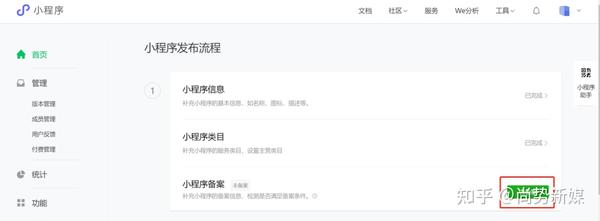
如下图你能看出这是用Stack布局实现的吗?这种布局用处还是挺多的,比如头像上有昵称,电话;还有遮罩效果等等。
效果图

让我们具体的来看一看它自身的属性。
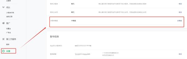
alignment
这个属性和Container控件的对齐属性是一样的,具体的介绍在Flutter控件之Container记录,这里直观的给出属性的作用。
Widget _alignStack()=>Container(
    margin: (top: 10),
    color: ,
    constraints: (height: 180),
    child: Stack(
      //子控件的对齐方式是
      alignment: ,
      children: [
        Container(alignment: ,
        color: ,
        child: Text("",style: TextStyle(color: ),),),
        Container(
          height: 100,
            width: 100,
          color: ,

        ),
        Container(height: 60,width: 60,color: ,)
      ],
    ),
  );
效果图

textDirection
子文本控件文本的方向,有两种模式。
- 从左到右
- 从右到左
Widget _textLeftStack()=>Container(
    margin: (top: 10),
    color: ,
    padding: (vertical: 10,horizontal: 10),
    constraints: (height: 180),
    child: Stack(
      textDirection: ,
      children: [
        Text('left to rigt',style: TextStyle(color: ),),
      ],
    ),
  );
效果图

Widget _textRightStack()=>Container(
    margin: (top: 10),
    constraints: (height: 180),
    color: ,
    padding: (horizontal: 10,vertical: 10),
    child: Stack(
      textDirection: ,
      children: [
        Text(' rigt to left',style: TextStyle(color: ),),
      ],
    ),
  );
效果图

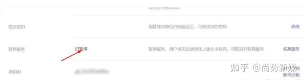
fit
子控件的填充模式,用于控制着子控件的大小。由一个枚举类StackFit控制。
- 按最小的来
- 按最大的来.
- Stack上层为->Expanded->Row, 横向尽量大, 纵向尽量小.取决于父控件
Widget _fitStack()=>Container(
    color: ,
    margin: (top: 10),
    constraints: (height: 220),
    child: Column(
      mainAxisAlignment: ,
      crossAxisAlignment: ,
      children: [
        Container(
          margin: (top: 10),
          constraints: (height: 60),
          color: ,
          child: Stack(
            fit: ,
            children: [
              Container(
                color: ,
                child: Text('',style: TextStyle(color: ,fontSize: 20),),
              ),
            ],
          ),
        ),
        Container(
          margin: (top: 10),
          constraints: (height: 60),
          color: ,
          child: Stack(
            fit: ,
            children: [
              Container(
                color: ,
                child: Text('',style: TextStyle(color: ,fontSize: 20),),

              ),
            ],
          ),
        ),

        Container(constraints: (height:60),
        margin: (top: 10),
        color: ,
          child: Stack(
            fit: ,
            children: [
              Container(
                color: ,
                child: Text('',
                style: TextStyle(color: ,fontSize: 20),),
              ),
            ],
          ),
        ),
      ],
    ),
  );
效果图

当子控件的内容超出Stack控件的时候,控制超出控件的内容是裁剪还是可见,有两种模式.
- 可见,但会超出
- 裁剪
Widget _overflowVisibleStack()=>Container(
    margin:  (top: 10),
    color: ,
    constraints: (height: 40),
    child: Stack(
      overflow: ,
      children: [
        Positioned(
          top: 15,
          child: Text("Flutter 基础布局Widgets之Stack\nFlutter 基础布局Widgets之Stack",
            style: TextStyle(color: ),),
        ),
      ],
    ),
  );
Widget _overClipStack()=>Container(
    margin:  (top: 40),
    color: ,
    constraints: (height: 40),
    child: Stack(
      overflow: ,
      children: [
        Positioned(
          top: 15,
          child: Text("Flutter 基础布局Widgets之Stack\nFlutter 基础布局Widgets之Stack",
            style: TextStyle(color: ),),
        ),
      ],
    ),
  );
效果图

Positioned
在Stack布局中用于控制子控件位置的组件。其构造方法:
const Positioned({
    Key key,
    this.left,
    this.top,
    this.right,
    this.bottom,
    this.width,
    this.height,
    @required Widget child,
  })
顾名思义就是从各个方向控制子控件的位置。
class StackWidget1 extends StatelessWidget {
  @override
  Widget build(BuildContext context) {
    return ConstrainedBox(
      constraints: (),
      child: new Stack(
        alignment: , //指定未定位或部分定位widget的对齐方式
        children: [
          Container(
            child: Text(
              'positioned-null',
              style: TextStyle(color: ),
            ),
            color: ,
          ),
          Positioned(
            left: ,
            child: Text('positioned-left'),
          ),
          Positioned(
            top: 18,
            child: Text('positioned-top'),
          ),
          Positioned(
            bottom: 18,
            child: Text('positioned-bottom'),
          ),
          Positioned(
            right: 18,
            child: Text('positioned-right'),
          ),
        ],
      ),
    );
  }
}
效果图

THE END